Diagnostic Plots for Linear Regression Analysis in Python.
Background Info
Linear Regression and the need for Diagnostic Plots
Linear regression is one of the most commonly used machine learning model. This model assumes that the relationship between the predictor (x) and the outcome variable (y) is linear, and the slope coefficients, and R^2 values are used to tell us how good the model is at representing the data. This is not the whole story, and in fact, some relationships are better explained using different mathematical models (polynomial, logarithmic).
The reason this is important to discuss is that operating under false assumptions will result in poor model performance.
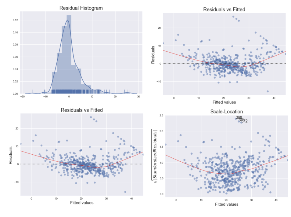
Residuals is the difference between the observed value and the mean value that the model predicts for that observation. Residuals are useful showing how poorly a model represents the data, and more importantly, if the linear regression assumptions are met.
Linear Regression Assumptions
- Linearity: The relationship between X and the mean of Y is linear.
- Homoscedasticity: The variance of residual is the same for any value of X.
- Independence: Observations are independent of each other.
- Normality: For any fixed value of X, Y is normally distributed.
Other key points that may influence and/or leverage the regression model.
- Outliers: an observation that has a large residual (it is very different from that predicted by the model).
- Leverage points: An observation that has a value of x that is very far from the mean of x.
- Influential observations: an observation that can change the slope of the line, and have a large influence on the fit of the model.
Diagnostic Plots for Linear Regression
Why is this important?
To test if the data can be described by a linear regression, several diagnostic plots have been developed. Learning how to use these tools are essential when conducting an regression analysis. Five plots will be described in this post.
- Residual Histogram
- Residuals vs Fitted
- Normal Q-Q Plot
- Scale-Location
- Residuals vs Leverage
The project goals
- To illustrate how to use each diagnostic plot listed above.
- To describe how to interpret the plots.
Resources & Citations
- Links valid as of 8/23/20.
- Understanding Diagnostic Plots for Linear Regression Analysis, Bommae Kim, University of Virginia Library, Sep 21, 2015
- Regression Diagnostics, Boston University School of Public Health 1/6/16.
- Boston Dataset.
- Creating Diagnostic Plots in Python and how to interpret them. Robert Alvarez. 6/4/18
Research Objectives
Methods
Data
- The data for this project was obtained from sklearn datasets.
- The boston house-price data is ideal for regression analysis, and contains 50-6 instances, 13 dimensions.
Analysis
The programming language Python was used in this project. The matplotlib and seaborn libraries was used
to visualize the data. Pandas was used to wrangle the data, while numpy and statsmodels
were used in the calculations and machine learning models.
Content:
Data extraction, transformation, loading, and exploring pipeline
Residual Histogram
Residuals vs Fitted.
Normal Q-Q Plot
Scale-Location
Residuals vs Leverage